Get in touch
Think that we can help? Feel free to contact us.
UpShift has been building e-commerce websites using Shopify since 2013, so we were excited to see their announcement of Online Store 2.0 in mid-2021 at Shopify Unite.
On paper Online Store 2.0 looked like a major jump forward that fulfilled items on our features wishlist and removed some hurdles to the narrative rich, flexible design approach we prefer. But, the proof is in the metaphorical pudding, in this case building a Shopify Online Store 2.0 site.
We started work on building Burkes Cycles - one of New Zealand’s biggest online cycle stores - a brand new website using Online Store 2.0 in July 2021. The site went live in October 2021 and this post is about our experience with building on the new platform.
First up the geeky bits. The Online Store 2.0 development environment has taken a huge leap forward with Github integration and a far better local environment developer experience. In Plain English this means software developers can easily work together on the website at the same time - with everyone in a team building different parts of the site and seamlessly combining their work together.
The new theme architecture has opened the way for far more flexible design and content. In short, Online Store 2.0 allows for a flexible, modular approach to all content pages which enables designers and content creators to build rich content and design via the Shopify CMS (Content Management System).
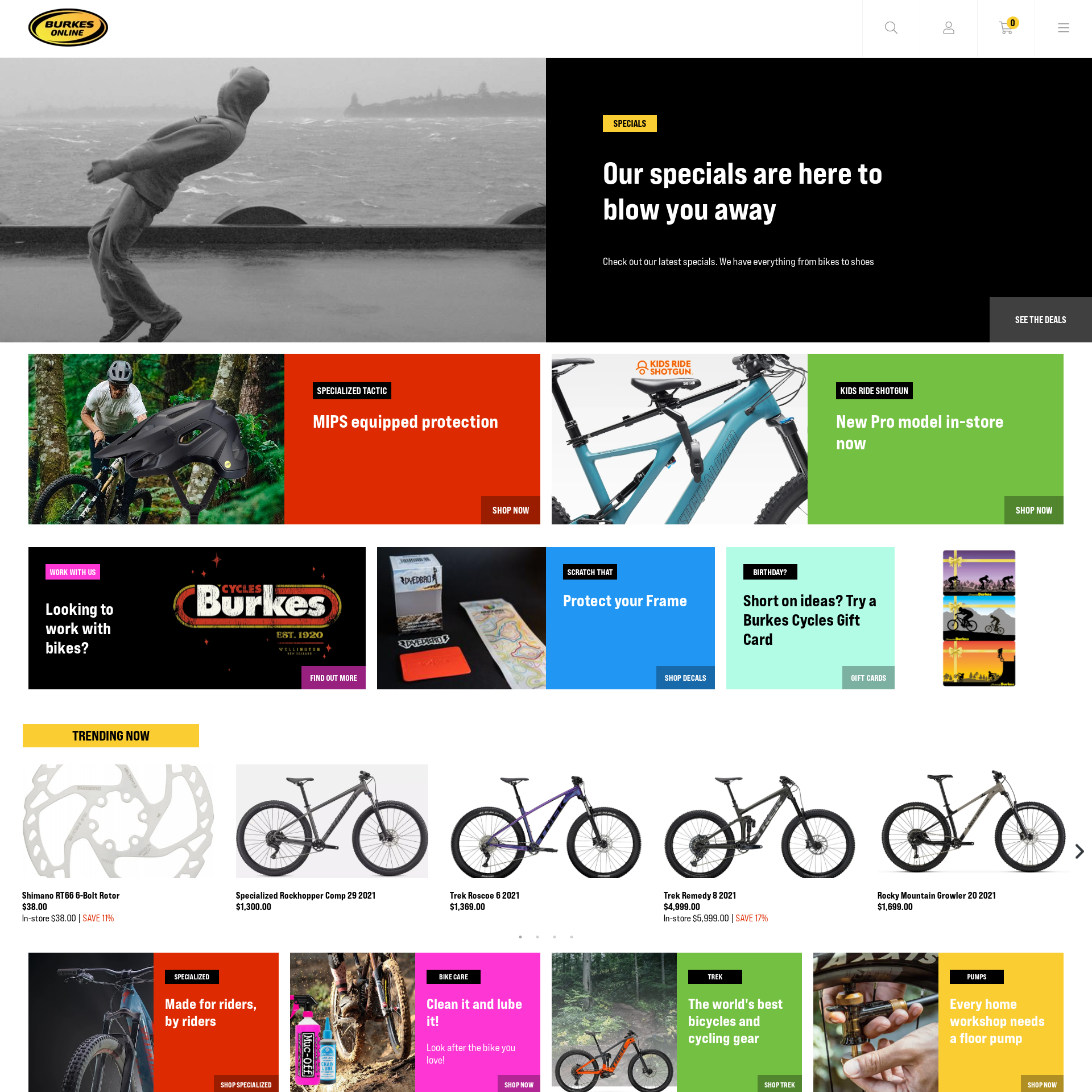
We spent some time exploring the capabilities of the new architecture before turning over our findings to UpShift’s design team. An example of what can be achieved with Online Store 2.0 can be illustrated on the Burkes Cycles homepage.

In the Shopify CMS, each row is a movable/ editable content section. Each section has content tiles and each tile can be configured in a variety of ways to suit the content and design requirements. At the foundation of this approach each content tile is running the same code and editable in the same way in the CMS. Only the “Trending Products” tiles and Instagram feed are using different (flexible) content sections.
That same approach with the flexible content tiles can be applied to every content page and browsing around Burkes Cycles you’ll see how their website team have used it to create their own layouts to meet their needs.
This new level of flexibility doesn’t just apply to the content, product information is also far more flexible. This gives developers and store owners the ability to add more hidden and public information for better product management, categorisation, navigation and discovery.
All up we’ve been really impressed with the functionality and flexibility of Shopify Online Store 2.0. The architecture and implementation is well thought out and brings benefits to designers, developers and most importantly the store owners.
If you’re using Shopify for your business it’s well worth looking into how an upgrade to 2.0 could work for you.