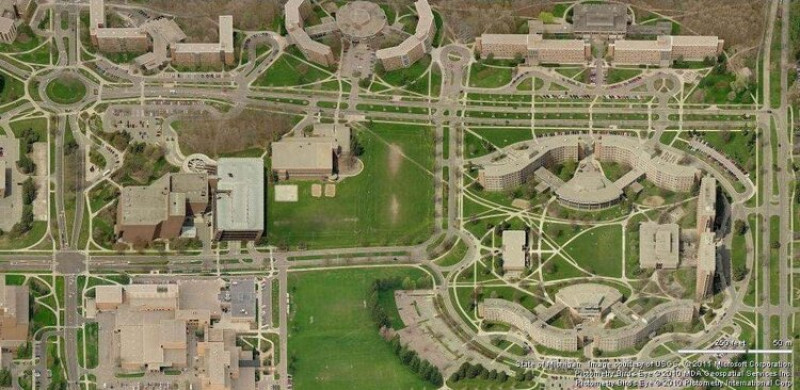
“Desire paths” is the name given to those short-cuts our feet follow, which aren’t part of the planned pathways around us.
It could be a line of dirt cutting across a grassy park corner, or a gap in the fence next to a busy road. The town planners & landscape architects didn’t plan them - but people have created them as the path of least resistance towards where they desire to go.
A planned path may sweep majestically through landscaped hillocks & shrubbery, but if people using it find a better way to get where they’re going they will vote with their feet & create a new path off-piste.
Some landscape designers have taken the people first approach & a number of universities waited to see the paths their students took before laying down the paving. Michigan State University is an excellent example of this, with their path system looking remarkably direct compared to the classic approach to landscaping:

This approach works well in the physical world, but what about digital?
How do digital creators recognise & enable desire paths in their work?
This is something I’ve grappled with for years & I’ve come to this conclusion:
Nothing beats giving someone a task & watching them use your product for the first time.
It has been some of the the most educational & most painful experiences to ask someone do something on an “intuitive” interface - only to see their mouse zoom off in completely unexpected directions & for them to complete the task in a way I didn’t think was possible.
The challenge with digital is we hard code the paths into our applications & for most part the users don’t have much of a choice how they do something. They can’t vote with their feet to create new paths, like we do in the physical world.
UpShift has recently worked on a couple of projects which employed iterative prototyping with multiple user tests.
For this a working prototype is created, user tested & then tuned from the feedback for another round of testing. We use Adobe Experience for interactive mock-ups or build in VueJS for advanced functionality.
Getting user feedback on the paths they desire to take is incredible value for creating technology that enables rather than limits it’s users.
The flipside is that iterative prototyping & proper user testing is time & resource intensive. It’s the sort of thing the can easily get pushed out of a project budget.
Even without user testing you can gain a lot by removing hurdles from an interface (pop-overs are a common block to user experience) & looking at how people are navigating via tools like Google Analytics. User testing doesn’t stop at product launch.
As digital creators we need to recognise that sometimes we might be making paths that our users find cumbersome or frustrating. By watching & listening we can create paths they desire to help them get to where they’re going.

