Get in touch
Think that we can help? Feel free to contact us.
I often find myself using house building analogies when it comes to explaining software development. Technology has developed it’s very own language & while saying “I’ve compiled the SASS & pushed it to Git” works for developers it leaves most people baffled.
“Architecture” is a term shared by construction & technology. In this post I want to talk about the architecture for structuring content in apps & website.
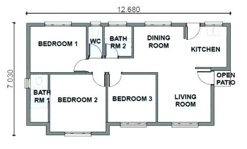
Back to the house building analogy. If you went to a building company & asked them to build you a three bedroom house the floor plan might look something like this:

So far, so good. This sort of layout has been in use for decades & it works really well.
You like the plan & are ready to commit, but then you have a thought about the future:
Your elderly parent is independent at the moment, but you can see a time where you may have to care for them. Maybe adding self-contained bedsit to the house would make sense if/when this time comes.
Suddenly the original plan doesn’t look fit for purpose. Where would a bedsit connect to in the current plan? There’s no place add another bedroom without connecting it to the living area & you couldn’t extend the hallway without seriously eroding the space for “Bedroom 1”. Without changes to the initial plan adding a bedsit at a later date is going to be even more of a headache.
How does this relate to digital?
At the beginning of each project we always ask about the content & functionality the client wants at launch & what they think they’ll need in the future. This allows us to design space into the application or website where future requirements can be connected at a later date.
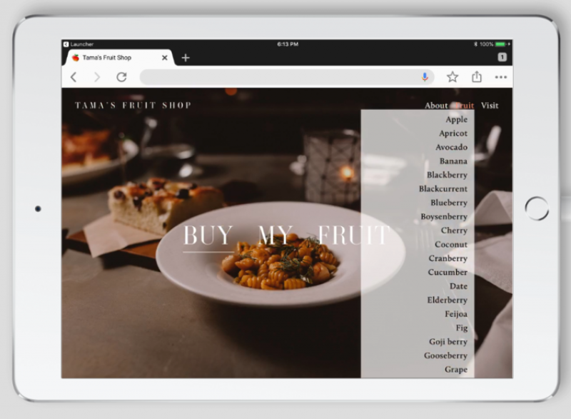
A common example is designing navigation that has space for future content while still remaining usable. Endlessly items adding to navigation is a common mistake for long running websites. In most cases the ideal number of menu options is eight or less, but poor menu structure planning can sometimes lead to the menu disappearing off the bottom of the screen.
In the example below someone hasn’t thought about what products they might offer at the beginning & just added to their drop-down menu as their range has increased. What an idiot! How could they have structured things better to start with? Would it of made sense to break their products into categories from the beginning?

The challenge is that like life, projects are a journey & requirements can change - often in surprising & unforeseen ways.
In my house building analogy the circumstances with the parent could end up being totally different. They could meet someone, they could decide they’d like to live in a retirement community, the kids could move out before the parents move in etc.
But identifying possibilities & factoring them into initial plans can help future proof your project to let it grow where your journey & circumstances take you.
Banner Photo by Daniel McCullough